


Branding
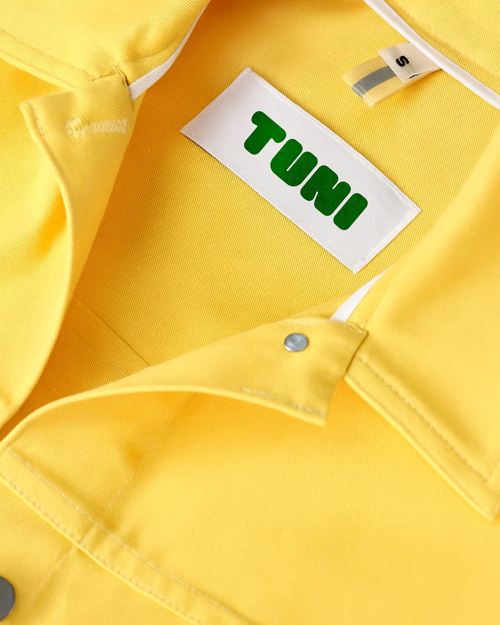
TUNI
In a world where wellness often feels like a race toward perfection, TUNI offers something different: a mindset rooted in realism, simplicity, and daily choices that genuinely feel good. We developed TUNI’s visual and verbal identity to reflect this philosophy: where wellness isn’t a set of rules to follow, but something you shape on your own terms.
We began by defining the core of the brand: a new wellness mindset grounded in accessibility, personal rhythm, and real-life balance. TUNI believes that taking care of yourself shouldn't feel like a burden - it should feel like something you actually want to do. This idea of holistic, everyday wellbeing -flexible, inclusive, and quietly revolutionary- guided every creative decision.
From there, we moved into the visual world.
We started with the image of a grocery basket: a symbol of routine, care, and intention. Familiar, humble, and full of possibility. We abstracted its shape to build a graphic system that feels fresh, minimal, and modular - designed to grow alongside the brand.
Every element -from tone of voice to color palette- reflects this idea of wellness on your own terms: easygoing, thoughtful, quietly optimistic, and always within reach. Because feeling good shouldn’t be complicated - it should just feel right :)
Gastronomy
